Your cart

(0)

Search

The Seven and Five Society

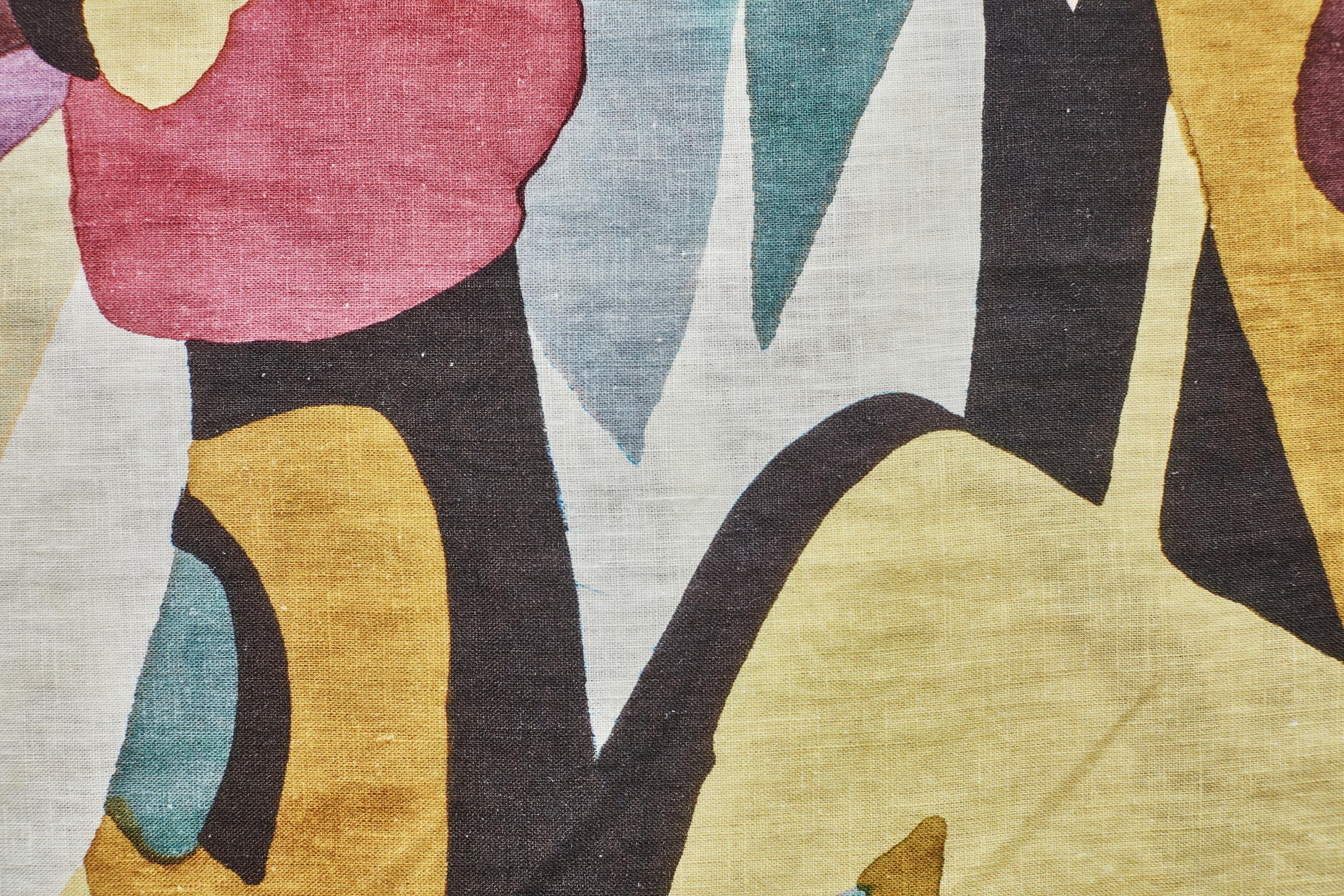
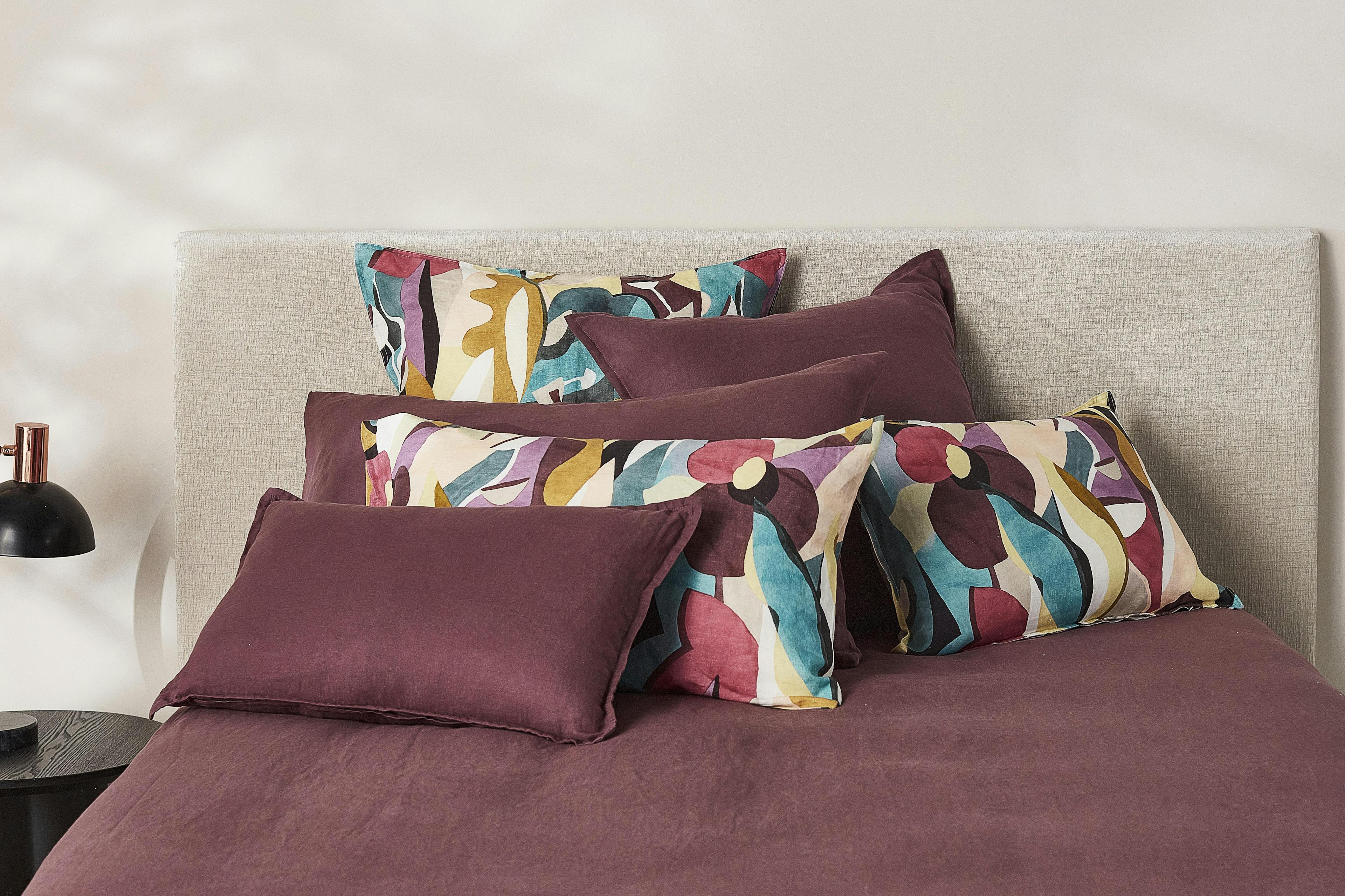
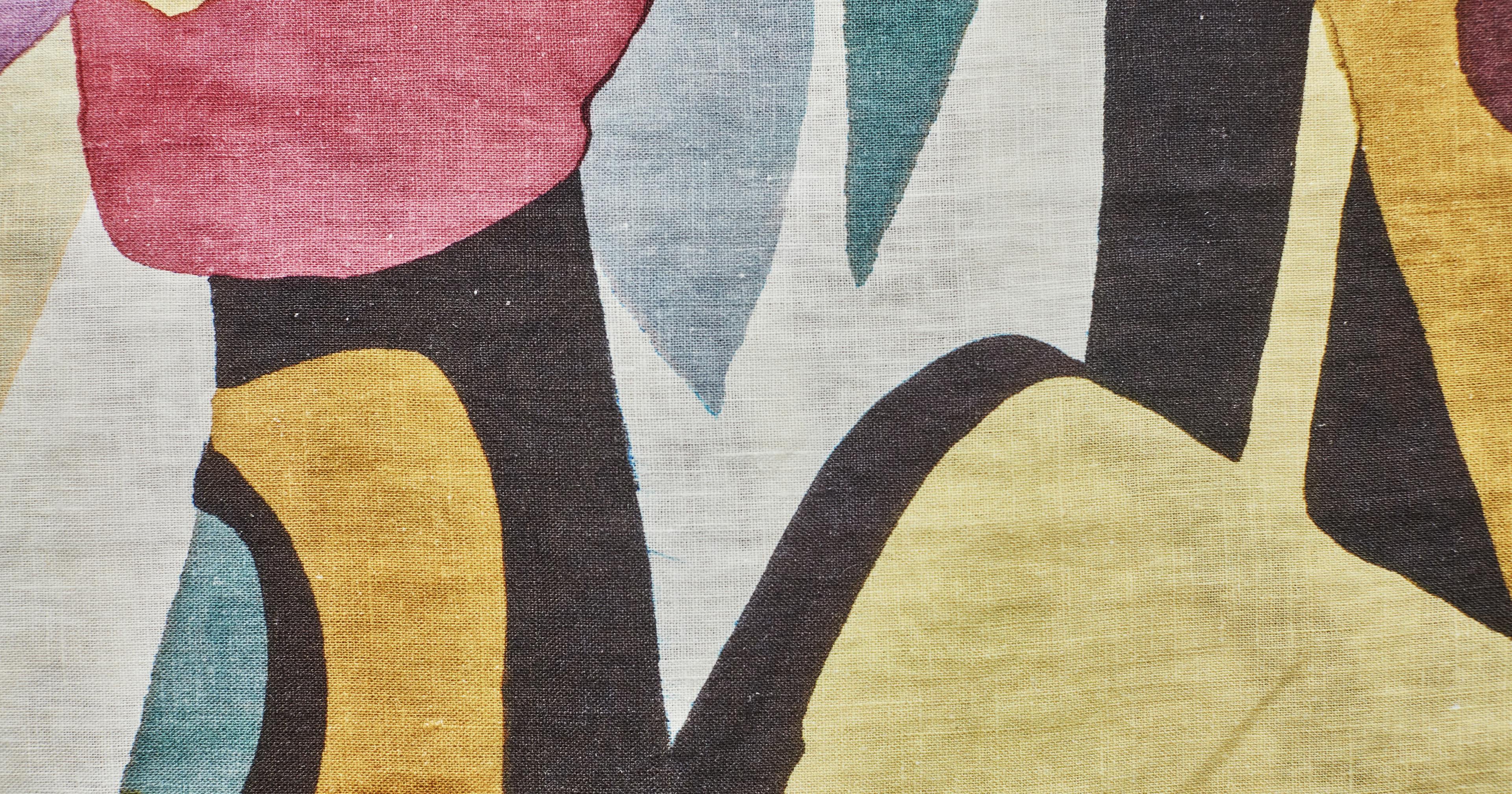
Colour 102: Moore’s Tints and Tones

In the early 1930s, the influential arts group known as the Seven and Five Society, initially comprised of seven painters and five sculptors, began exhibiting together in London. At its centre was Henry Moore, most famous as a sculptor but also known for his drawings, along with fellow sculptor Barbara Hepworth,  and a group of painters that included Ben Nicolson and Frances Hodgkins. Eschewing the figurative, they made modernist abstract works influenced by ethnographic art and natural forms.

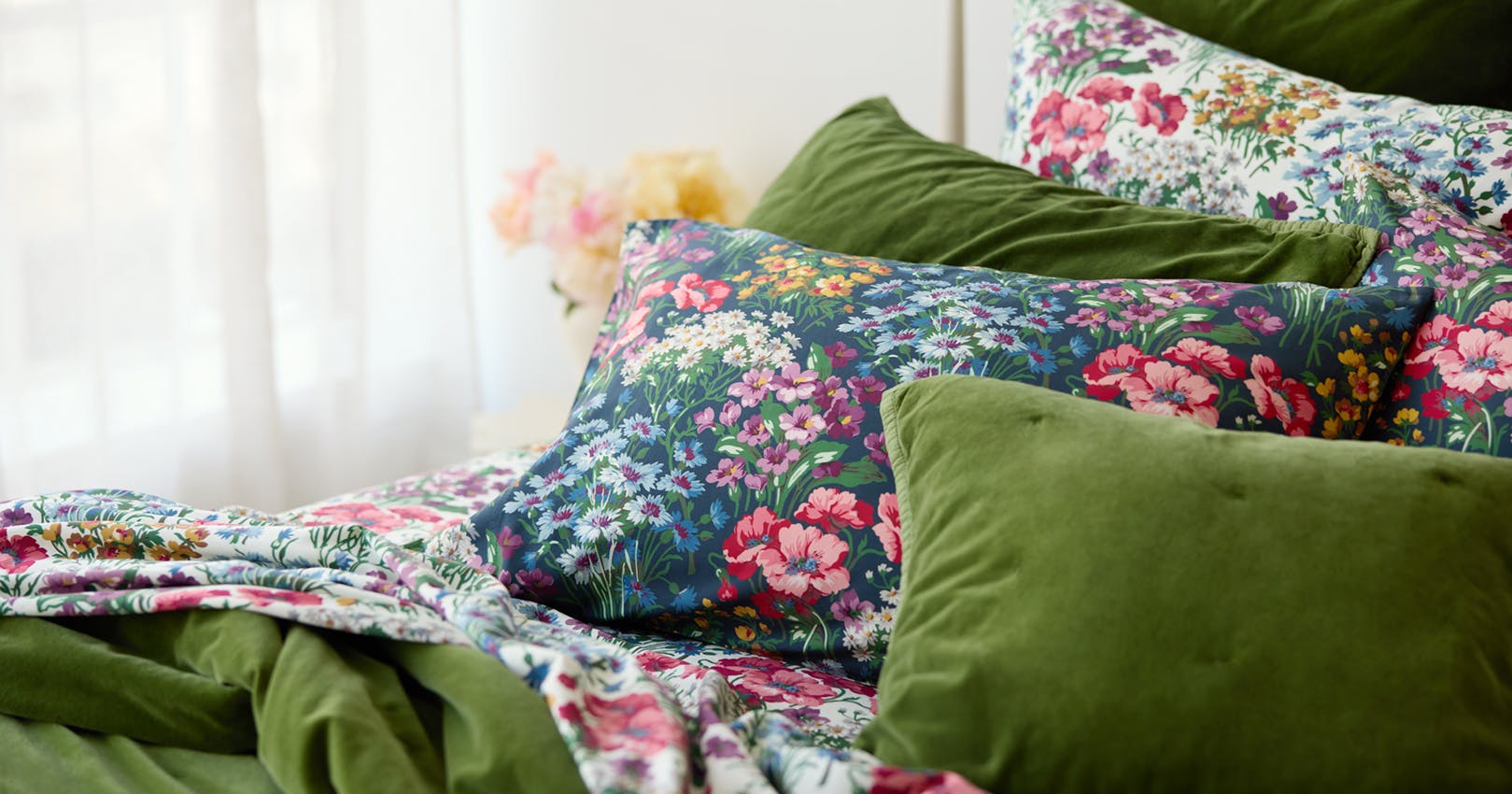
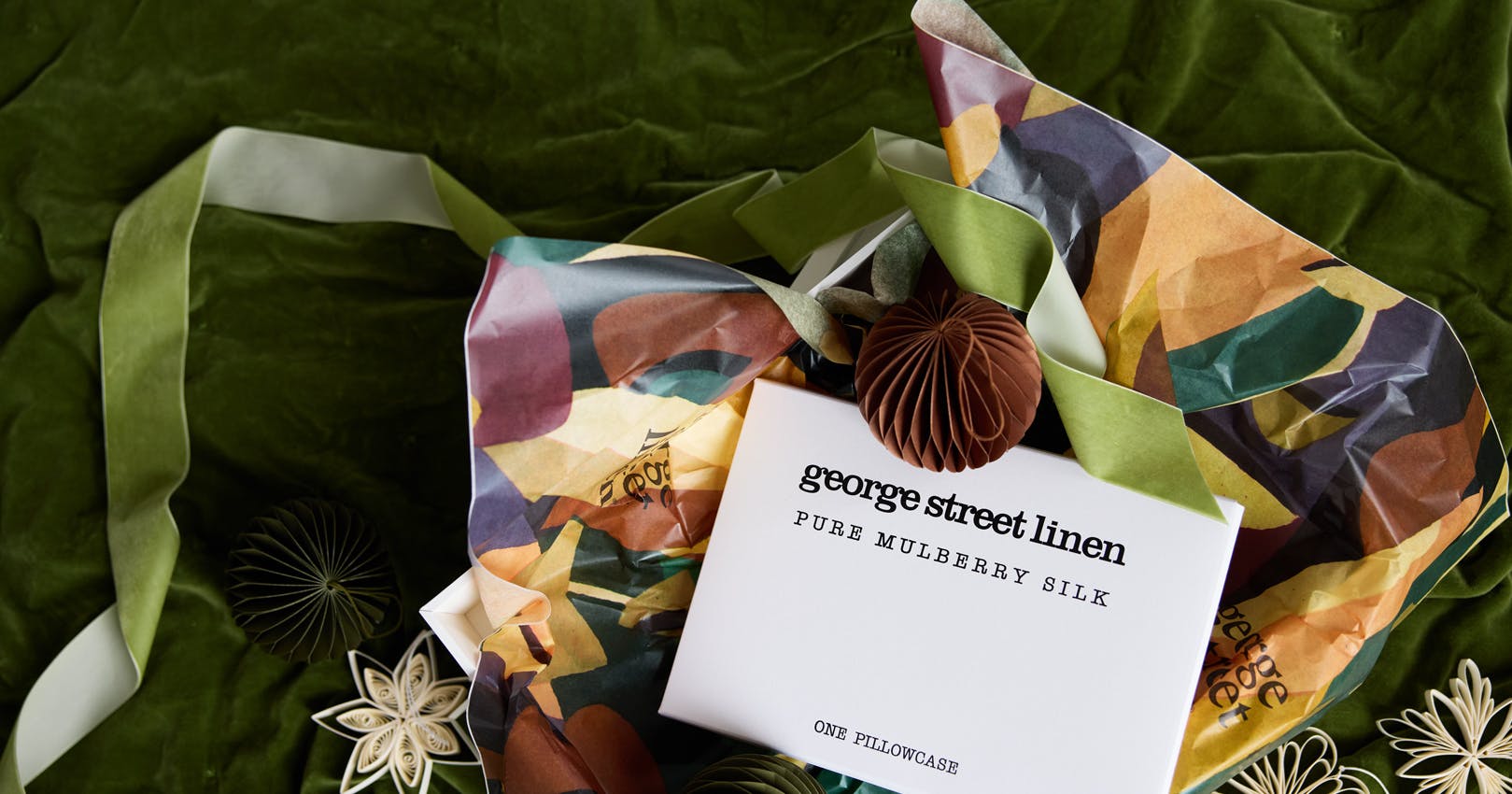
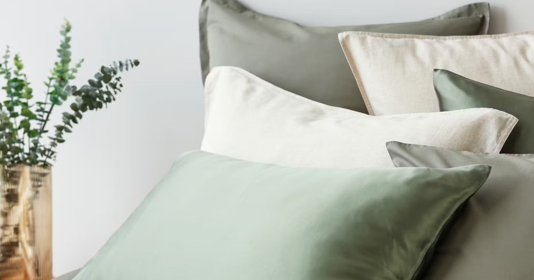
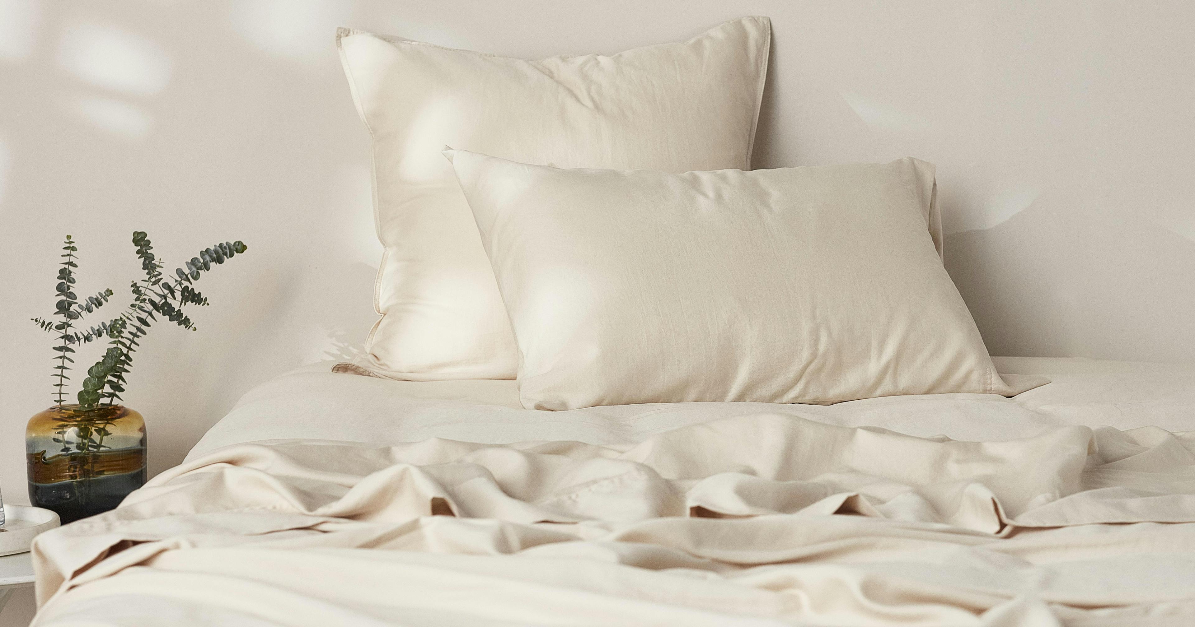
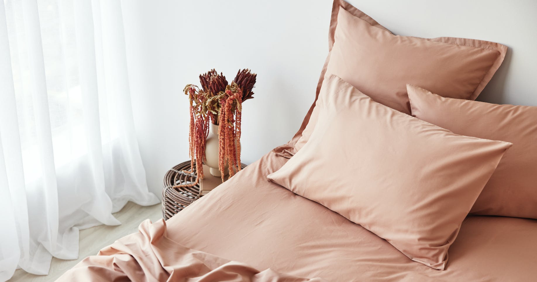
At George Street Linen, we’ve been deeply inspired by the Seven and Five Society's distinctive colour palette—a clever combination of tints and tones—and their abstract shapes and patterns. This inspiration led us to design a stunning collection that pays homage to their artistic vision.


Shop Moore

Understanding Tints and Tones

The Seven and Five painters utilised a unique approach to colour. They would start with pure primary colours (red, yellow, and blue) or secondary colours (violet, green, and orange), then add white. The amount of white used determined the intensity of the colour: less white resulted in a more intense colour, while more white produced a subtler, luminous tint—similar to the soft yellows in our bed linen.

When, instead of white, they added a little black to the primary or secondary colours, the violets would turn into mauves, the yellows mustard, and the greens olive – what are known as tones.


The Art of Combining Tints and Tones

Combining tints and tones successfully is an art in itself.  Using only tints can result in indistinctive and insipid designs while relying solely on tones can make the palette look muddy. The key is balancing various intensities. For instance, using a yellow tint with 10 percent white alongside blue, green, and red tones created with different percentages of black can create a harmonious pattern.

White is also essential in itself. In designs that incorporate both tints and tones, white can enhance contrast and ensure that the colors do not blend into each other. This is particularly important in abstract patterns, where distinct color variations are crucial for creating visual interest. For example, a pale blue tint can stand out against a deep, toned green, creating a striking contrast that draws the eye. 


Our Collection’s Unique Touch

The Seven and Five Society's innovative use of tints and tones has left a lasting legacy in the world of art. Inspired by the Seven and Five artists, we've also incorporated a touch of white into our bed linen designs. This approach, mirroring the techniques of these pioneering modernists, ensures our patterns are vibrant and full of life.

At George Street Linen, we celebrate this legacy through our carefully crafted collection, blending the timeless appeal of their color techniques with modern design elements. Explore our collection today to bring a piece of this artistic heritage into your home.


You might also like